Why we love Storybook?
Konabos Inc. - Konabos
15 Nov 2021
Why we love Storybook? In this video, we go through the benefits of using Storybook. How a tool like Storybook can impact your deliverables.
Transcript
Note: The following is the transcription of the video produced by an automated transcription system.
All right. Today, we talked to Mr. Mike Edwards about why we like storybook so much. So Mike, what is storybook and why should we like it so much?
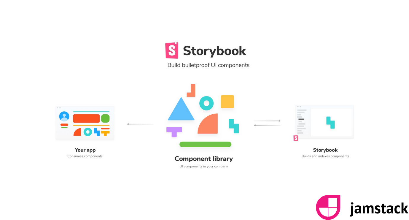
So StoryBook is a tool that allows you to basically demonstrate the sort of visual elements of your website and see them really rapidly, so it makes it really quick to tell scaffold up new components like buttons or blog renderings or things like that and actually see them on a sort of dummy page. You can tell us, No, is this thing looking the way I want it to look like? Does it work on the different screen sizes that I might be using to use? And it's just a great way of really rapidly prototyping UI elements for a website. You know, you don't have to build all the backend out. You can literally get started with this thing in about five minutes and have a few components in there and seeing what they look like. It's just a really nice tool for that quick prototype.
So how is this different than the ones before Mike in the past? Right. So the designer does the design. We get the markup cut up and put it into static pages essentially, right? And then you are able to demo it to the customer play around with it. Like, where? How does storybook change that?
Storybook change that because of the fact that's interactive, so you're not just seeing these static UI elements might you can actually go in there, change the content so you can do the simple things like if I put a really long title in, does my UI component break sort of common things, which you know, nobody thinks about until they've got to production? And that first article gets written by somebody that has 300 characters in the title and suddenly components are shifting all over the place because no one thought, Oh, the title might be this long. So it has that part of it, which is great. Also, if you're doing like an atomic UI, it really works nicely into that because you can see each of those layers of that atomic structure building up into a full page. So it just gives you a really nice way of breaking these things down into small components and seeing them right at the start of the project so you can make sure all your UI is working at the start of the project. Also, with the development team and stuff like that, it means you can also kind of divide off the sort of UI rendering aspects from more of the backend business logic aspects and then bring them together at a later date.
So basically, before we used to put the markup directly in the components themselves, now we're separating the components into their own atomic design, for instance, a button and then the header and whatnot. And then in our components, basically, you would use those different components from storybooks or the designs being
Separated essentially, right? I think he preys on me. But, yeah, so you would you'd have these you start with like buttons or images that you really sort of the most the smallest components that you might get on a page and then you can build those up into other components. Well, that allows you to create this is a nice design library so you can go in and look at your existing buttons and see what options do my existing buttons have. What colors can I change them to? What kind of effects might they have? And then I can pick those buttons, the bonds that I want to go and work on, the component that I'm going to be building. So, yeah, it's just a great way of being able to see them a small part and build into the bigger and lower levels or high levels. Do you have a demo for us today?
I do have a demo. All right, so this is a personal project site that I've been working on, and one of the things about the tweet last week is just to be friendly to the other devs in the team, like you can just put things like your standard stuff into here. So here I've got a material section. It just details the colors that we're using and the hex numbers that they're going across there. I need to improve this because I'm also going to add in there like the variables that they should be using if they're using Sass and stuff like that. But it creates a single location of truth there for these sort of design elements. Same with things like logos. I can go on here and we can see what the different logos might be available to the project, what they look like on different colors and things like that, which is also great and the same with typography. So it just gives us a really nice place where it's all in one and we can see all our UI design elements in a single location. Then, as I said before we moved out into kind of the atomic structure of things, so I've got an image here. Hopefully this is. Working. I love live demos because something always goes wrong, isn't it? Let's take this on Splash one here. So this is great, so I can see it's just a simple image, but I'm using the service called Unsplash. For those who may not know what a splash is, it's a free sort of stock photography website, loads of great images that you can just use for commercial personal use. But with one, I can do things like this, play with it and see what happens if I change the size and just gives me instant update.
I can see these things in real time. I can play around with setting the different focal points so we might want to change focal point and see what happens. I didn't shift much, but you know, we get small shifts, but you get to see the sort of real time updates, whereas with a static site you're not. It's going to take you a lot more work to if I want to see these changes and play around with things. Things they have got my items and then I'll use these to build up into. More interesting components here, so we've got like a blog, so I can see, right? How will that look? Let's go up then to seeing what this might look like on a mobile device. So I click on this one you can see here. I set these dimensions already to the different bootstrap break points, which means that I can then go right. What's it going to like on a tablet? Really easy. Really quick. What's it going to look like on an even smaller mobile? And you could set these up for bootstrap, but you know, so you could set these up for different mobile devices you might be using. It's an internal project, the different screen sizes, systems that might be within the business. Normally, you know you'd have to be pressing F12, get the Chrome dev tools up or five hospitals up and then be dragging backwards and forwards and stuff, and it's a bit slower to do that. This just makes it super easy. And then if I get something like blog, you know, we talked about title links and stuff like that. So. Uh, this is actually a. No one, but I can come in here and just play around with the content and see,
Does this show the different components Mike like you're using the Unsplash image, you're using the one you're using at different elements, right? So this component can you see the different subcomponents it's using in here?
In this one, at the moment, I can't. But you do get this documentation section, and I haven't really documented this at the moment, but you can put in information about how this component is constructed. Guidance on how you should use this component or use the item of your design as well. So you can do all that sort of stuff if you want it to really fill that out. You can also create custom pages where it might be like a welcome page or an explanation page and all that sort of stuff, so you really fill this out with as much as you want. And then if we keep going down while I deal with them, bringing these different elements together. To see what would the patient look like if I used all these different elements together? Yeah, I could start to scaffold these up. So if I wanted to, maybe we've got a new content type, like maybe we've got a news patient needs to come on. What I can do is quickly within storybook is just go find the half dozen components I might want to use. Start creating a page here, then move that to the marketing team or whoever in the business that should see this and say, What do you think of what we've got here? What's missing? What new components might we need? And so we can actually really have an interactive way, then, of quickly prototyping new ideas before we've gone through the whole process.
You can actually just play with it up front, see what feels right to start with before we go into whole full design spec build process. So it just really cleans up and makes that whole thing a lot quicker. Oh, it's awesome. Cool. Yeah, I think it's a great thing. I mean, it's great to it's one of those tools why I think to myself, I wish, I wish I had this when I started out in web development about 20 years ago because it would have made life so much easier and made so many projects so much quicker. Also, it forces a kind of a good best practice. You know, you have to separate your UI from your business logic. So you start to fall, so separations are layers, which means things easier, test makes easier things easier to extend and much more reusable.
Yeah. Thank you so much, Mike. And hopefully we'll come back to it with many more examples. Yes.
If you have any questions, please get in touch with me. @akshaysura13 on Twitter or on Slack.

Konabos Inc.
Yay to Konabosing in style! Content tagged with the Konabos handle is produced by two or more Konabos team members.