Form Fails - When good submissions go bad
Bruce Davis-Goff - APAC Operations Director
9 Jun 2021
Forms are often the primary method for interaction on many websites, and in that respect, they are an intriguing and unique opportunity to engage with visitors.
Consider this; a form is a transaction; the person completing the form is giving personal information in return for whatever you can give back. Sounds like a great place to make a deal, right?
They are the only place you can get this level of user transparency – they are literally telling you how you can fulfill their intent.
Sadly, forms are often a pain in the ass, too many questions, weird validation, invasive fields that make you think “why do they need to know how many pets I own?”- essentially no-response-into-the-void, exercises in frustration.
So first I’m going to list the top form crimes, then I’m going to walk through an example to show how forms can bring outstanding value to your business.
The Crimes
Unfocused Intent
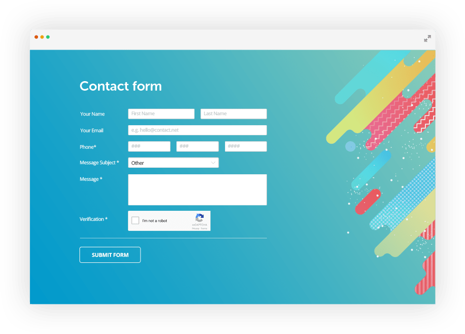
The first question should be “what is the purpose of this form?” a typical answer might be “To provide customer feedback.”
This will usually result in a form with the following fields:
• First Name
• Last Name
• Message
Ok, it’s a start, the next step will sometimes be around allowing the user to select a topic, usually from a drop down. This is hopefully populated with the results of analysing what questions users typically ask both online and through other channels. i.e.
Reason
• Complaint
• Lost password
• No service
• Other
The purpose of this field? A good question and I’m glad you asked, some answers might be:
- Automation – to redirect the submission to the appropriate staff member.
- Categorization – to review submissions and get a steer on how submissions are grouped, are they impacted by other business events – for example, a new services page might generate queries, or an offline services outage could be driving traffic.
If you are not bothering with either of these, this field may be redundant, if the submissions are simply going to a single email address, the recipient will know what the email is about without having to be told – and at least the category won’t be that annoying “Other.”
But here is the other side of the coin; the customer has reached out to you and they want something. You also should want something too and that something is to engage with the customer.
Often form submissions are treated as an annoyance, whereas they are an opportunity for dialogue.
Many sites now use an autoresponder, a simple message along the lines of “Thanks for contacting us #USERNAME#, we will respond within 24 hours.”
If you are using a smart engagement automation system like Sitecore you can go even further:
- Extend your auto-response with tracked backlinks to you site to drive traffic and engagement and help with profiling.
- Personalize these backlinks using whatever information the user has provided.
- Enroll the user in an engagement automation plan that might for example wait 48 hours and then send a follow up message along the lines of “We hope your enquiry was sorted, if not check out these links or here are other things you can try, also did you know we are giving away subscriptions to this or that and you may be interested in this etc.”
- Add them to a marketing list, assuming you got opt-in, a list of specific form submitters, filtered perhaps by a field criteria, may prove valuable for reaching out later.
Bad UX
Here are the 10 crimes that will cause form dropout:
- Too many fields - a form that is too long is daunting, keep the form to just the fields you need and plan your engagement from there, make it short and sweet and you have a better chance of getting more information further down the track.
- Validation – it’s necessary for data integrity but be careful, I’ve seen many a form that is just plain stupid by trying to use clever regex to validate a field that becomes unusable, for example where the user’s surname has a hyphen or other special characters. Also make the failure messages relevant – which works better? “First Name is a required field” or “Please make sure you have entered your first name.”.
- Responsiveness – this is easy, just make sure your form work across all devices, especially mobile, busy people will often fill in forms on their phone in transit.
- Properly labelled fields – make sure they are all lined up with the fields they relate to. Why do you want my phone number? – This field is often a deal killer, don’t use it unless it’s vital to server the customer, we don’t like invasive field, oh no we don’t.
- Complicated fields – explain them well in a modal if you must, or better yet ditch them.
- Engaging call to action – Submit is the most common but doesn’t convert as well as “Go” or “Send Email”, also the color should stand out making it easy to spot.
- Requiring a specific format – the date field is the biggest culprit here, using dropdowns generally work best here, free text field is next to useless. Dates need to be machine readable later so make sure you are saving in a standard format.
- What are you doing with my info? – reassure people that their data is safe with you with short privacy statements and links to your overall privacy policy.
- Unneeded fields – requiring data that does not apply to everyone is a sure-fire way to increase drop out, do you need everyone’s physical address? And will it be saved in usable format?
- Illogical sequencing – have fields in a logical intuitive order allows users to predict what they may be asked next, for longer forms, break up logical sections and show progress.
There is more but this is the most wanted. Sometimes having too much information on one form can be overwhelming. Consider reducing the visual clutter on the form and aim to have the user focus on each question to complete the form in an efficient manner.
In summary, forms provide the opportunity for increased engagement. conversions and revenue and should be treated appropriately; track them, test them, optimize them, personalize them and you can make a huge digital difference.
To talk to us about optimizing forms contact us here: https://konabos.com/contact/

Bruce Davis-Goff
As a five-time Sitecore MVP, with 15 years of experience working with, and for Sitecore, Bruce brings a valuable depth of skill and experience and a commitment to best practice excellence.
Bruce is a passionate Sitecore Architect with specialist skills in SXA, strategy, migration, and upgrades and is a certified developer, trainer, and NZ Sitecore User Group / SUGCON organizer. His background as a Sitecore Business Development Manager, coupled with solid technical skills, and enthusiasm for getting the most out of Sitecore, means
Bruce brings value to any project and currently looks after operations for the APAC region.
Share on social media