Heads-Up Front-End Developers For Sitecore!
Anindita Bhattacharya - Sitecore Solutions Architect
3 May 2021
While working on Sitecore sites, there are certain considerations that need to be made by the front-end team while authoring the HTML.
While Sitecore does not impose any restrictions on the HTML, there are certain best practices – which when followed, will make the integration of back-end components with the HTML much smoother and would enable the back-end Sitecore developers to follow best standards as well, seamlessly.
The front-end team can simply deliver the HTML & front-end assets as is expected for any website development and adhere to the guidelines entailed here. Following these pointers should make for a seamless experience even for a front-end team that has no prior experience with sites on Sitecore.
HTML Page layouts
Sitecore pages follow a component-based architecture.
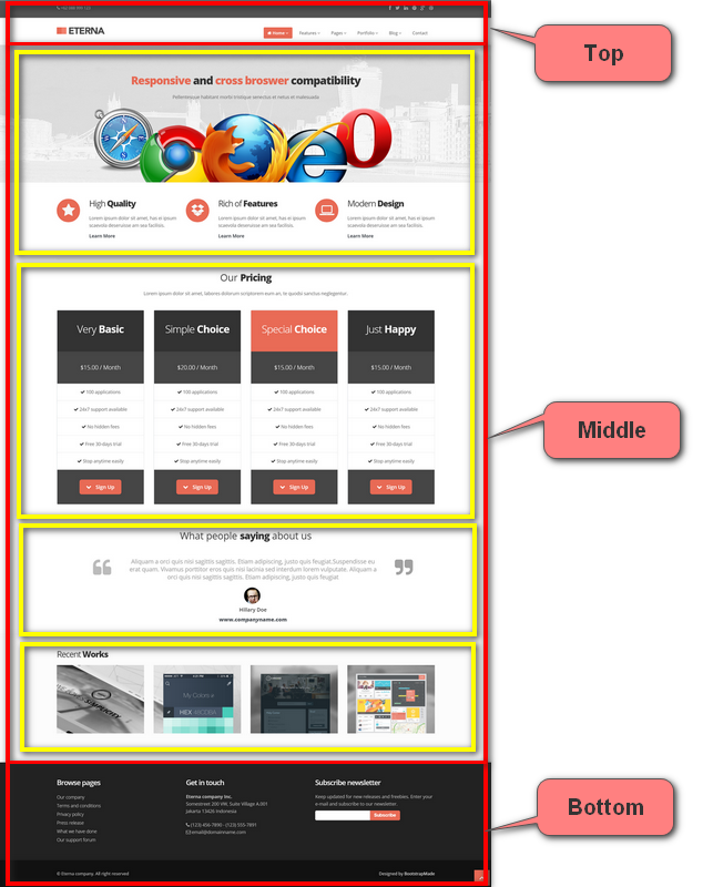
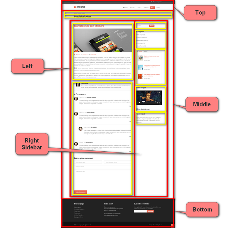
Once the designs of the pages are available – the best practice would be to chalk out the page layouts. Divide the page into columns as called for by the design and divide the content into components within the page layout. This would essentially allow us to create placeholders or buckets where components can be dropped. Components can be assigned to placeholders as well – as a constraint to maintain design integrity.
Some examples of Page Layouts are as below, with placeholders chalked out:


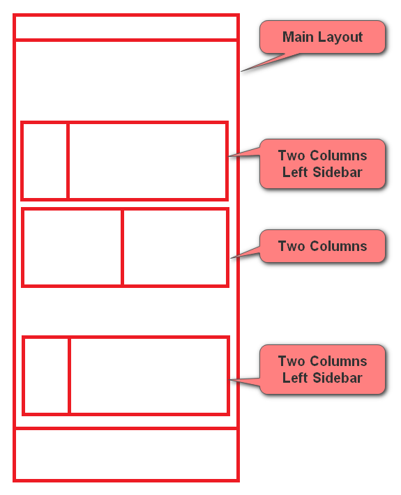
You could also have a combination of layouts on a given page:

This gives you the flexibility to organize pages & components as specified in the designs.
The main thing to keep in mind here – is the markup for these layouts – which MUST be consistent no matter which pages it is used on. Which is to say, the wrapper tags which create the columns in the manner needed must be consistent, with a common inner tag where we can drop in all the compatible components. For example – if the design calls for multiple pages using the ‘Two Columns Left Sidebar’ layout, the same outer markup should be used on these pages – that divides the page into two columns.
As a back-end developer, one could of course account for any must have inconsistencies, for example – varying background colors, etc., but these should be kept to a minimum, and should ideally be catered to using single classes for each case in the outermost wrapper div is feasible. This allows the back-end developers to manage such inconsistencies using rendering parameters and adding/removing the specified classes in the markup based on the values selected.
Modular Components
All components must be modular and have all classes/attributes they need to completely render themselves in a separate container as such. There should be no interdependencies between the identified components, and apart from the decided-upon page layouts markup – there should be no additional wrappers around multiple components.
To assure consistent markup, it would be advisable for the front-end team to use a templating engine.
Do note, since each component is independent, it can be reused in multiple pages, on various positions in a page, and in different placeholders – if needed by the design, e.g. In the main body and in a sidebar.
A component might also appear more than once on the same page with different content – do ensure that the CSS (Cascading Style Sheets) / JavaScript strictly uses classes as opposed to ids to accommodate for this.
Identify reused components
While different projects/clients and agencies have varying business processes with website development, there should be a phase where the components are identified from the design, and it is decided whether a given component can be reused with minor tweaks/configurations. Whether this is done as an activity while creating the functional specifications by the business analyst OR as an activity taken up by the project manager in planning meetings with the front end & back-end teams – this is an activity which should be done before HTML development of a certain page/section is done.
This is more of an activity to visually compare and group together (if possible), similar components with minor differences. For example – you might have the same component appearing on different pages with different background colors, or with an optional left margin etc. Do note – the differences really should be minor, which can ideally be managed with one or two classes or minor markup changes – which can be handled from the back-end using rendering parameters or fields on component data sources – as is appropriate. If the changes seem a bit more than that, it is advised to create separate components, in lieu of creating complicated back-end logic simply to output the right HTML – which would result in difficult to maintain & complicated to author components.
Address Design Inconsistencies
As a front-end developer, you would work off designs provided to you from the UX / Design team. Based on the previous points – regarding modular components, and component reuse, whenever you see instances of inconsistencies in design, like spacing between components being inconsistent, font sizes etc. – it might be a good idea to regroup with UX designers as well. A lot of these inconsistencies can usually be resolved with the design team and save a lot of complications during final development phase.
Page specific markup - a No No!
As specified above, Sitecore pages are ideally built of independent components, placed together in blocks using generic page layouts.
There should ideally never be any page-level classes (like about-us / search-results etc. - say on the body tag) used on the front end. All such markup should be a part of modular components only.
A note to add here from a back-end perspective – while it is tempting to resolve such instances using a ‘class’ field on the page items – it is not a good practice. The whole point is to separate the content from the presentation, and this kind of association will also need additional security work to lock down such fields so that content authors cannot make changes & break the design inadvertently.
Links
A couple of pointers here to keep in mind while authoring links on your pages:
- Always Use <a> tags for anchors, use buttons for elements that act as switches (which then would perform an action assisted by JavaScript)
- Favor adding classes to anchor tags over wrapping inner text in additional tags wherever possible. This would aid in keeping the back-end code cleaner, and easier to ensure experience editor support.
Rich Text
Sitecore has a rich text type field available, which allows content authors to manage formatted content. This is stored as HTML internally and gives the content author the ability to view & edit this content as HTML. This can be both a boon and a curse depending on usage!
Ideally, whenever your designs show formatted content – like page body, with hyperlinks / strong fonts, etc. within the content block, it would correspond to a rich text field in Sitecore.
Because of the fact, that the content author has complete control over the HTML that appears in this field, and additionally, that Sitecore also uses some conventions as content is typed into the Rich Text Editor directly, here are some pointers to keep in mind while styling formatted content:
- Try to keep the markup of this formatted content as simple and predictable as possible.
- Any styling that is needed for the rich text content – should ideally be done using classes on a wrapper that wraps the contents of the entire rich text field. While it might not always be feasible to achieve this 100% due to design complications – do remember, that adding any complicated markup with classes / other attributes increases the risk of content authors inadvertently changing this markup and breaking the design while editing content.
- A note for back-end developers here – in case the HTML which goes into the rich text field in Sitecore has a lot of classes / special tags – look into providing custom classes & snippets in the rich text editor for content authors to use.
- When a content author types content in the rich text editor – Sitecore does add <p> tags to the content to denote paragraphs as opposed to line breaks. The best practice would be to not use <p> tags in the HTML intended for rich text fields – to avoid <p> tag nesting & incompatible markup resulted from editing content in the editor mode of the rich text field.
Experience Editor
Sitecore has a robust WYSIWYG experience editor mode to edit content. There are some considerations to be made while authoring the HTML to make sure there will be no conflicts with the experience editor mode functionality.
- Consider that experience editor mode will insert additional markup. Avoid using position-based selectors in CSS / JavaScript.
- Sliders/carousels etc. – are initialized using JavaScript but editing the content in these constructs can get tricky. Depending on the level of complexity of your components, you could choose to initialize sliders/carousels in normal mode only (Ps. Back-end team can add a class on the body tag to indicate which mode is being used to view the site easily). Not having these initialized in experience editor mode, makes all content in such components easily editable. This, however, does limit the WYSIWYG property of the editing mode for such components. A good solution here is to train content authors to use preview mode for previewing websites, post-editing content in experience editor. Both these modes typically run off the same database (and hence content).
jQuery
- If you are using jQuery in your project, it is highly recommended that you use noConflict() to avoid framework clashes (for experience editor)
- Use closures and wrap your code in a self-invoking function. Here are some references for this:
- https://api.jquery.com/jquery.noconflict/
- https://programmersought.com/article/72996716873/
- https://blog.mgechev.com/2012/08/29/self-invoking-functions-in-javascript-or-immediately-invoked-function-expression/
API integration/jQuery work
For features such as listings/search – where there might be pagination/faceting/filters & sorting – there might be the need to interact with the back end via APIs, to get updated content & display on the page based on user action without refreshing the entire page. Depending on the kind of data & business need, you could follow one of the below approaches to ensure quicker back-end integration with lesser back and forth:
- Add the data needed as JSON string in the markup – and code the feature to work off this JSON. In this case, the back-end developers will have an example of the JSON they need to provide in the markup from Sitecore content to get the feature to work as intended. · Use a mock API, (with hosts like https://apiary.io/) Which will return JSON in the format you decide. The API URL must be present in the markup – so that back-end developers can replace this with the API they author – and ensure that it returns data in the same JSON format as prescribed by you.
While these features typically always need a good amount of front-end/back-end collaboration, picking to implement them in one of the above ways right off the bat does help in streamlining the process, and reduces the overhead of back and forth between teams to get the feature up & running.
Sitecore Forms
Depending on the kind of forms present on the designs, the Sitecore team would ideally make the call about whether to use custom forms or Sitecore forms.
Sitecore forms are typically used in forms that are required to be customizable by the content author. In this case, the content author can add/remove fields, configure the validations, configure where to send the form data & where to redirect the user after form submission among other things. Sitecore has its own form designer application built-in to aid in this.
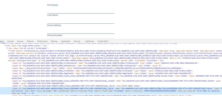
OOTB (out of the box), Sitecore forms allows for basic alterations on tags such as adding classes (with Sitecore 10.1 this is much easier on the content author since your back-end team can configure a list of classes for the content author to select from – as opposed to type them up!) and grouping fields into certain wrappers. It would be a good idea to request the back-end team to create a sample form with most constructs used on the forms in the designs and make the same available to the front-end team, before building out the markup – so that the front-end team can try and work around the generated markup – as opposed to trying to customize the generated markup during back-end integration.
An example here:

Keep in mind – Sitecore forms have robust OOTB functionality to create field validations as well. It would be great to style the Sitecore forms generated validation errors as well.

Anindita Bhattacharya
Anindita is a 7-time Sitecore MVP and has been working on Sitecore since 2013. She has worked in various roles on Sitecore projects, from being an individual contributor to a Solution architect, and enjoys being close to the code! She is the founder/co-organizer of Sitecore User Groups in Bangalore & Mumbai and is actively involved in the Sitecore community. She has over 14 years of experience in .NET technologies and is passionate about learning and keeping up with technology.


Share on social media